


Panel Configuration
Buttons buttons, icons, dropdowns and more
-
SUBVIEW
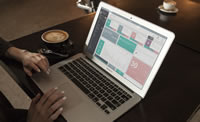
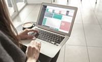
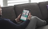
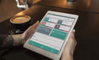
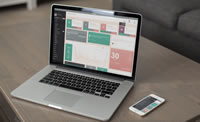
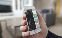
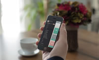
HI THERE!Try the Subview Live Experience
- Notes
- Add new note
- Read all notes
- Calendar
- Add new event
- Show calendar
- Contributors
- Add new contributor
- Show all contributor
-
3 MESSAGES
- You have 9 messages
- See All
-
SEARCH
- Dashboard
- Buttons
Buttons
Use any of the available button classes to quickly create a styled button.
Default Buttons
Colorful Buttons
Square Buttons
Do you like the square buttons? Add .btn-squared
to it
Disabled State
Add the disabled
attribute to <button>
buttons.
Sizes
Fancy larger or smaller buttons? Add .btn-lg
, .btn-sm
, or .btn-xs
for additional sizes.
Button tags
Use the button classes on an <a>
, <button>
, or <input>
element.
Button groups
Wrap a series of buttons with .btn
in .btn-group
.
Buttons with icons
Examples to use buttons with font awesome icons.
Examples to use buttons with glyphicon halflings icons.
Buttons with both text and icon.
Navigation icons.
Toolbar icon example
Only Icons
Icons and Text
Sign in with Facebook Sign in with Twitter Sign in with Flickr Sign in with Google
Animated Icons
Buttons with loading indicator
A UI concept which merges loading indicators into the action that invoked them. Click the buttons to see the effect.
Built-in progress bar
Sizes
Switch Buttons
Turn checkboxes and radio buttons in toggle switches.
Block level buttons
Create block level buttons—those that span the full width of a parent— by adding .btn-block
.
Dropdown
Dropdown buttons
Use any button to trigger a dropdown menu by placing it within a .btn-group
and providing the proper menu markup.
- Dropdown header
- Action
- Another action
- Something else here
- Dropdown header
- Separated link
- Dropdown header
- Action
- Another action
- Something else here
- Dropdown header
- Separated link
- Dropdown header
- Action
- Another action
- Something else here
- Dropdown header
- Separated link
Split button dropdowns
Similarly, create split button dropdowns with the same markup changes, only with a separate button.
- Dropdown header
- Action
- Another action
- Something else here
- Dropdown header
- Separated link
- Dropdown header
- Action
- Another action
- Something else here
- Dropdown header
- Separated link
- Dropdown header
- Action
- Another action
- Something else here
- Dropdown header
- Separated link
Dropdown button with icons
Examples to use dropdown with font awesome icons.
Sizing
Button dropdowns work with buttons of all sizes.
- Dropdown header
- Action
- Another action
- Something else here
- Dropdown header
- Separated link
- Dropdown header
- Action
- Another action
- Something else here
- Dropdown header
- Separated link
- Dropdown header
- Action
- Another action
- Something else here
- Dropdown header
- Separated link
Dropdowns button groups
Dropdown with checkboxes
NOTE:
By adding dropdown-enduring
class you can avoid closing the dropdown on click
Dropup menu options
NOTE:
By adding dropup
class you make dropup menu.
Dropdown Different Styles
- Dropdown header
- Action
- Another action
- Something else here
- Dropdown header
- Separated link
- Dropdown header
- Action
- Another action
- Something else here
- Dropdown header
- Separated link
- Dropdown header
- Action
- Another action
- Something else here
- Dropdown header
- Separated link
- Dropdown header
- Action
- Another action
- Something else here
- Dropdown header
- Separated link